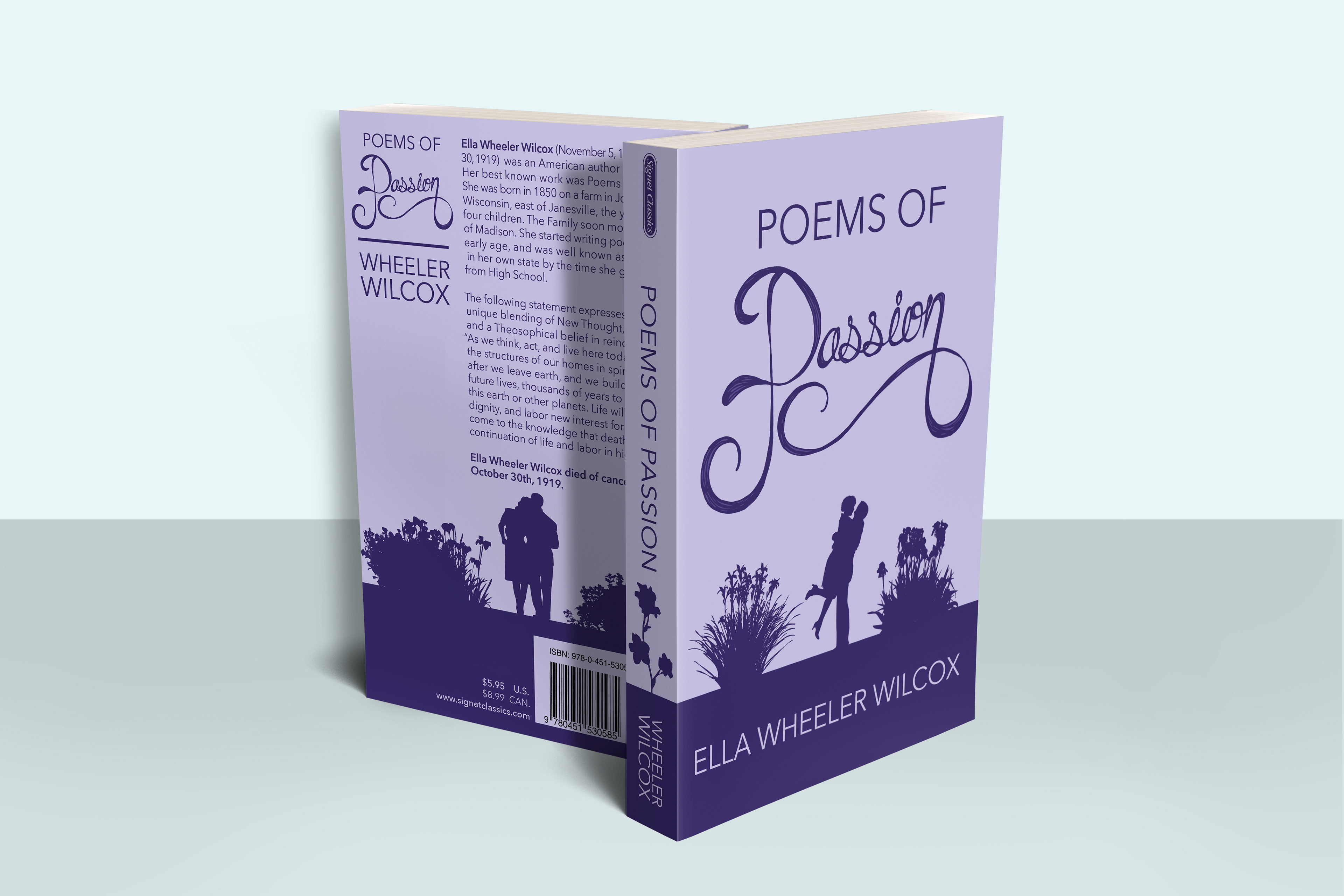
With these book cover redesigns, I wanted to take older, classics and give them more appeal to a younger, more modern audience. I used silhouetted illustrations and minimal typography to create that modern feel, but still included hand lettering to keep the classical influence.


